Serri Website
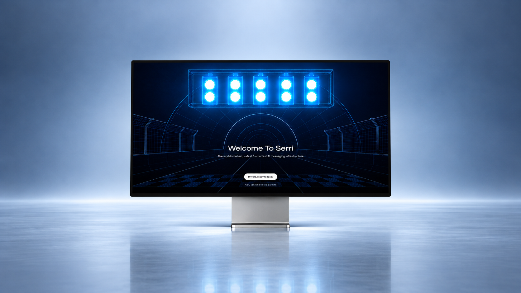
The customer is the driver, and Serri is the car.
Category
Success Story
Published
2026
Read time
3 min read
Serri is one of the fastest-growing AI communications platforms in India's enterprise messaging space. Built by Serri Tech Labs, it helps large brands run WhatsApp, SMS, Voice, and RCS campaigns at scale. So far, it has delivered 400+ million messages for 100+ businesses. Over the last year, the company grew around 5x.
The Brief
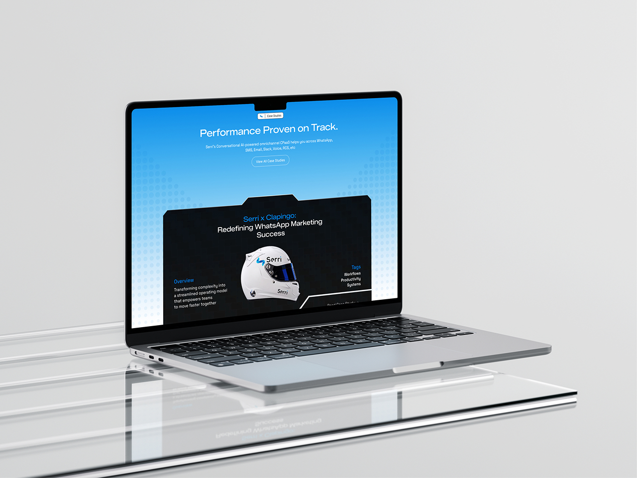
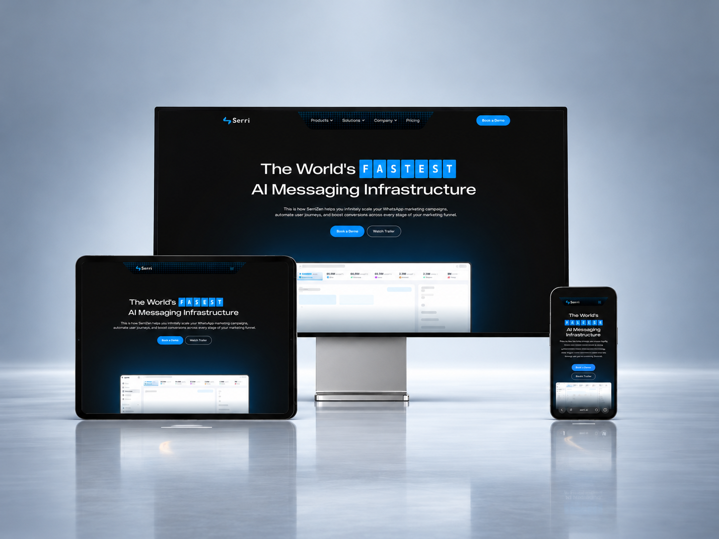
But the website wasn't communicating what the brand had become. That left room to sharpen the positioning, conversion path and the credibility of the brand. We created a landing page that works like a campaign on its own. Three words set the brief: speed, precision and technological advancement.
The Concept
We explored a spaceflight idea first, but it felt too far from everyday life and too niche. Formula 1 communicated the same ideas, but in a way more people instantly understand. It also matched how Serri's founder described the platform: an F1 car does not carry every feature a road car has, yet road cars inherit F1 technology almost without exception. We developed the story with the client: the customer is the driver, and Serri is the car.
The Entry Experience
The page doesn't open on a hero section. It opens on a question: do you want to race, or would you rather take the parking. Choosing to race plays the loader, which runs through the problems of enterprise messaging and how Serri solves them. It ends with the Serri logotype swept out of frame by an F1 car at speed. Choosing to park skips it and goes straight to the site.
The Design System
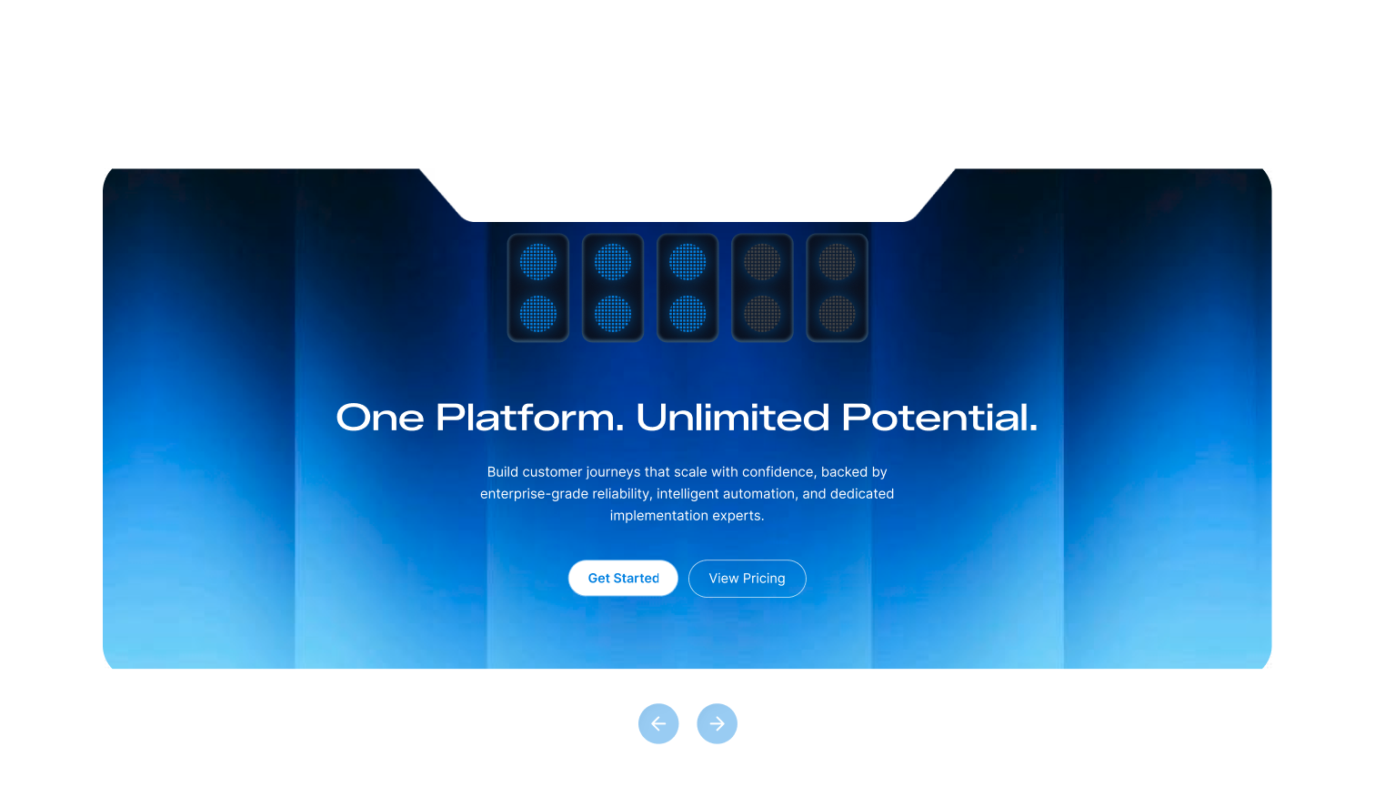
The design reinforces the idea of racing without getting in the way. Headlines use Zalando Sans Expanded, inspired by motorsport lettering. Body text uses Space Grotesk to feel technical and engineered. We also created custom HUD-style UI elements and telemetry bar graphs, animated to add energy and motion. Two main CTAs run through the page: one in the brand blue, and one using a carbon-fibre texture that appears only on white backgrounds.
Bringing It Together
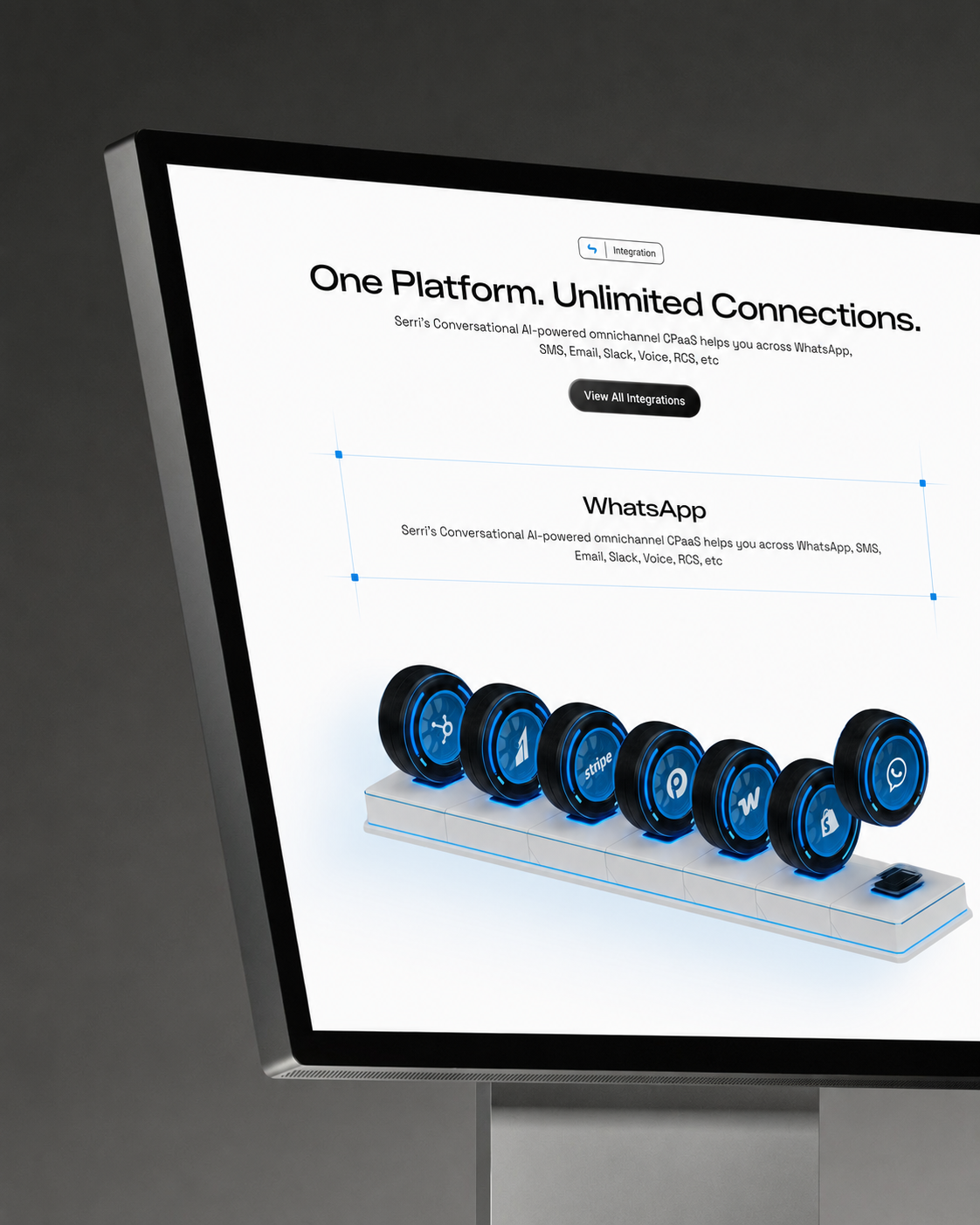
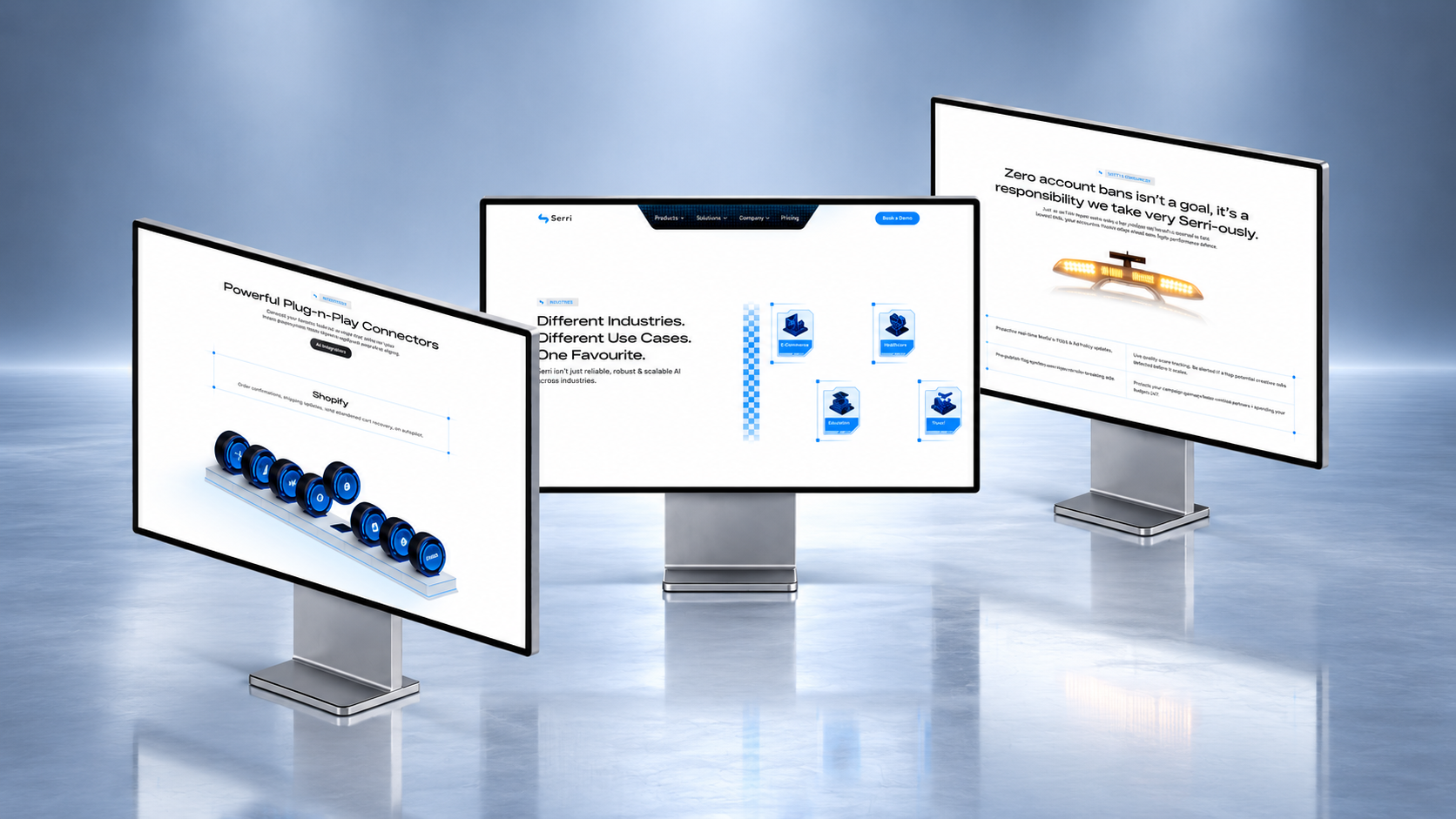
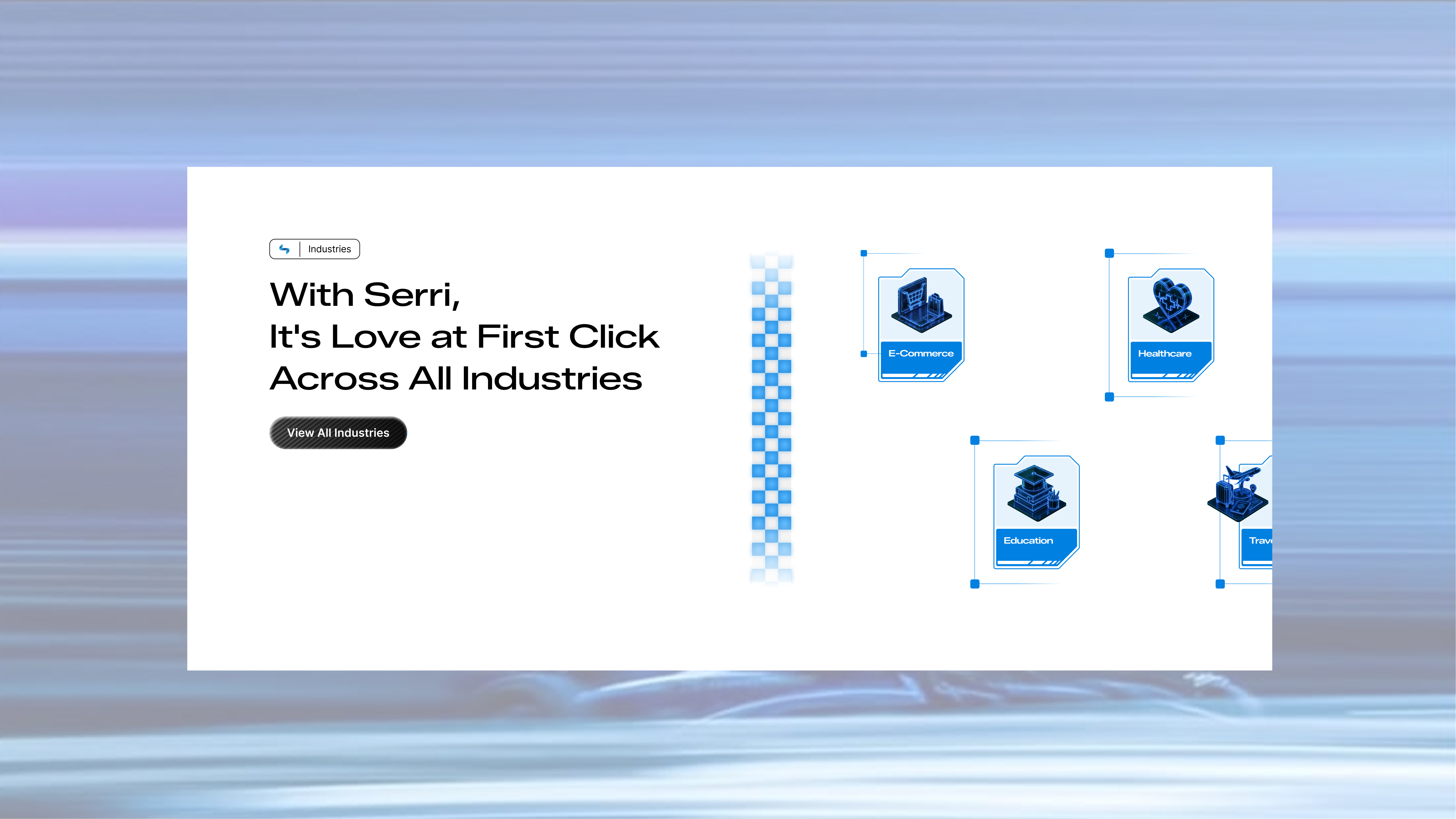
We carried the concept through the whole page using familiar race-weekend cues. A light bar on top of safety car introduces the section on safety and compliance. Integrations appear as a stack of tyres, each with a partner logo. Testimonials are styled like team radio. Industries are laid out like a starting grid. Every 2D and motion asset was built from scratch, so the idea feels real in every section, not just like a tagline on top.