Hyperface
A website and a design language for the company that runs India's credit card infrastructure, built for the scale it had quietly reached.
Category
Success Story
Published
2026
Read time
5 min read
Hyperface builds the software banks run their credit card programmes on. Onboarding, credit engines, rewards, lifecycle engagement, co-brand launches. All the machinery underneath the card in your wallet, none of which you ever see.


The Challenge
The platform now runs 8.5 million cards and moves 20 million transactions a month, for a customer list spanning AU Small Finance Bank, IndusInd, CRED and Flipkart Wholesale. The product had grown quickly and the website hadn’t grown with it. What existed still read like a company at the beginning of that story, not one running infrastructure at that scale, in front of the risk, product and technology teams who decide whether a platform is safe to build on. Two things had to be true at once: the site had to carry the company at the scale it already operates, and it had to establish Hyperface as the authority on how modern card programmes get built. Those pull against each other — scale wants restraint, expertise wants depth, and most fintech sites pick one and end up as either a beautiful empty brochure or a wall of bullet points. We took the tension to be the brief, and built a language before we built a page.
Signal Architecture
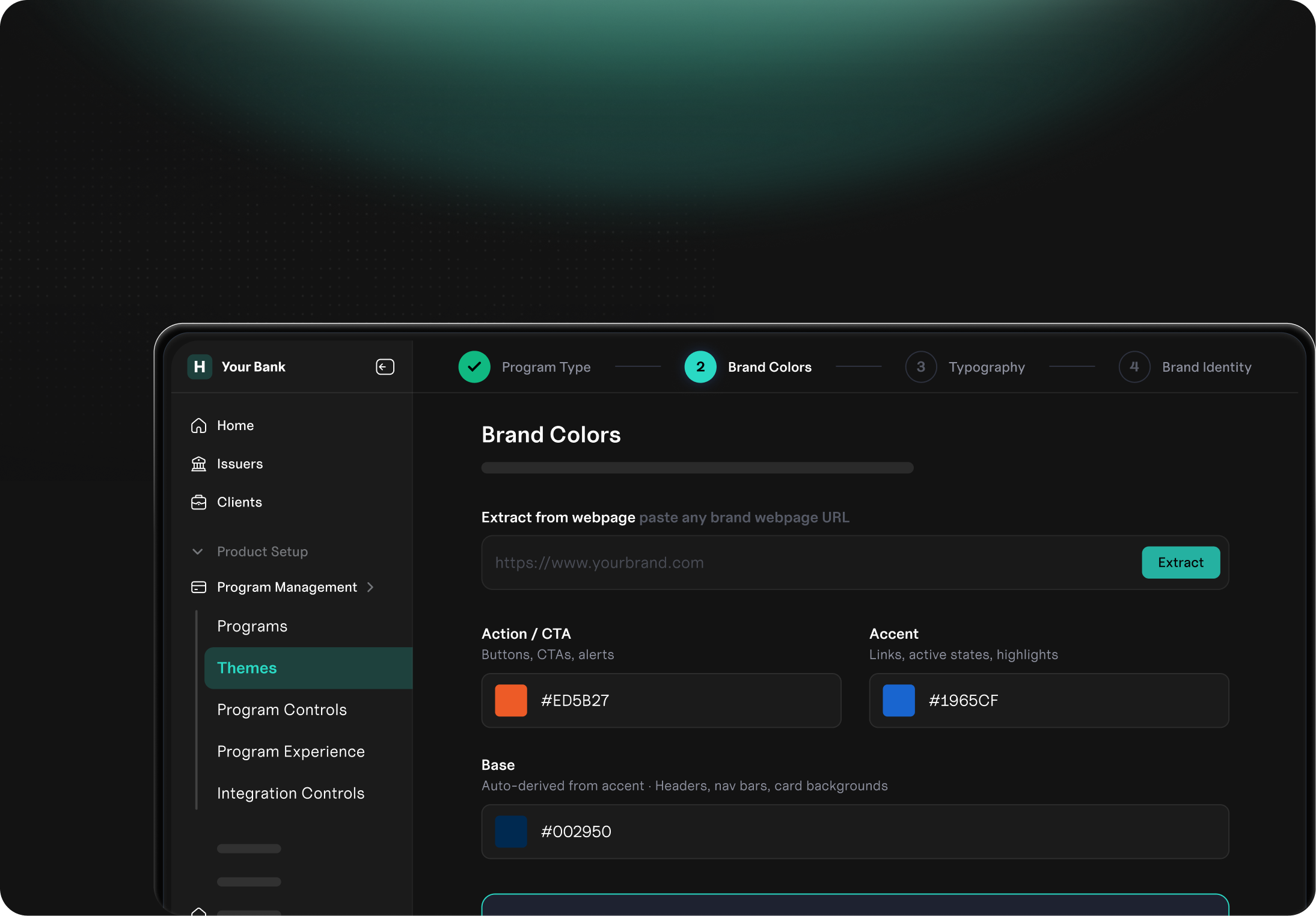
Signal Architecture is a design language made to express the invisible infrastructure behind a modern card portfolio: how customer activity moves through intelligence, compliance, automation and growth. It has five primitives, and everything on the site is built from them. Between them they turn scattered financial activity into something that reads as one governable system, which is what lets a growing product suite keep sounding like one company.
- Signals — what a customer does: a swipe, an intent, a response to a campaign. Drawn as moving points, pulses and trails.
- Rails — the infrastructure underneath: structured paths, routed lines, modular channels.
- Gates — the points of control, where something is checked, approved or refused: translucent layers, checkpoints, validation states.
- Fields — the terrain where signals pile up into pattern: heatmaps, clusters, behavioural zones.
- Engines — the automation: rotating systems, layered cores, decision loops.
The Visual System
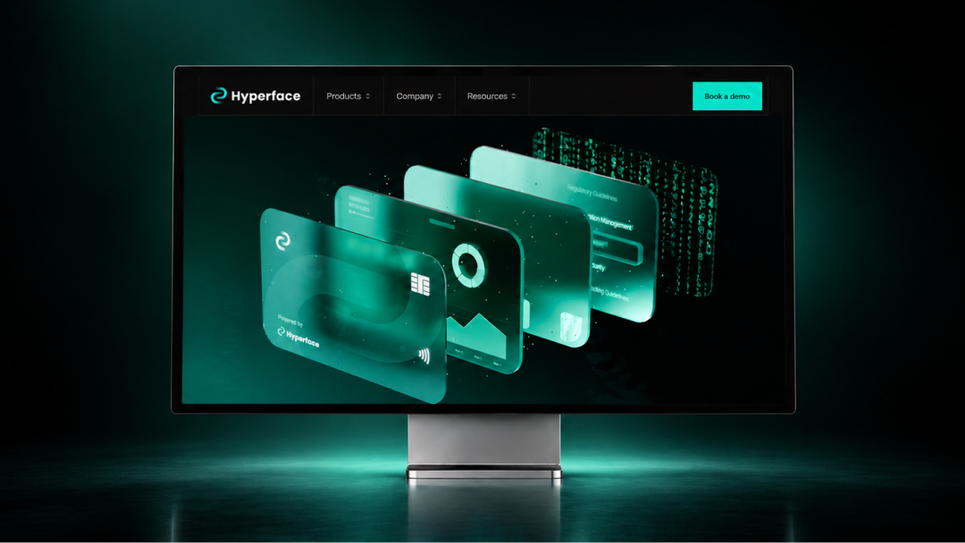
The canvas is near-black with a single mint-teal accent used sparingly, and borders doing the structural work that shadows do on lighter sites. No mesh gradients, no stock fintech illustration, no wall of security badges. The homepage opens on a stack of cards animated in 3D, a camera panning across a hero card with four translucent layers behind it — analytics, modularity, compliance, code — running from the most tangible thing a buyer cares about to the most abstract. Analytics is a flow field, streamlines pulling toward two centres of gravity, closer to a physical phenomenon than a graph. Modularity shows real Hyperface modules connecting into a live consumer screen, because it isn't a list of module names — it's the feeling of assembling something.
Compliance
Compliance is the layer that had to work hardest, carrying no text at all while still saying something a senior banker would recognise. The obvious icons are KYC, AML, a fingerprint, a lock — but those are things a bank does to its customers, and Hyperface's compliance story is about what a bank's own team can safely do inside the platform. So the layer leads with maker-checker, the rule that no one person can both create and approve a live campaign, alongside a timestamped audit log and role-based access, anchored to the ISO 27001 framework Hyperface actually holds.
The Five Products
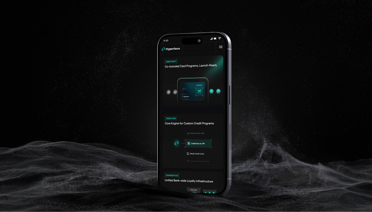
The five products are drawn as a grammar rather than five pictures. Read together they map onto the stages of a cardholder’s life, so a menu of modules reads instead as total coverage.
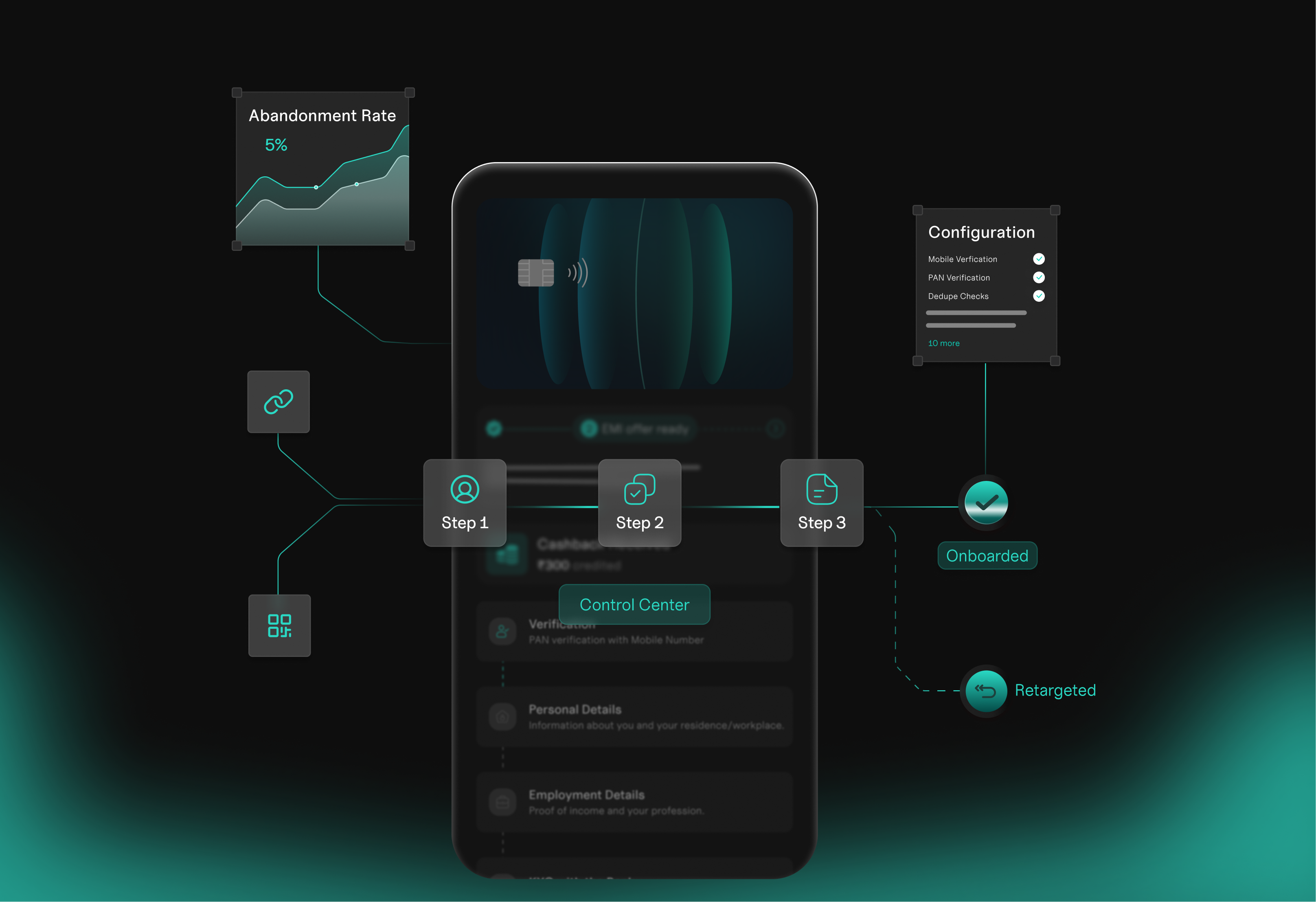
- Onboard IQ — a node chain converging on a checkmark: a funnel.
- Smart Engage — a pulse timeline with milestones.
- Credit Pro — one engine feeding several outputs.
- Rewards Plus — a convergence spine: earn sources curving into a single ledger and fanning back out to redemption, because its claim is one customer and one view across everything a bank sells.
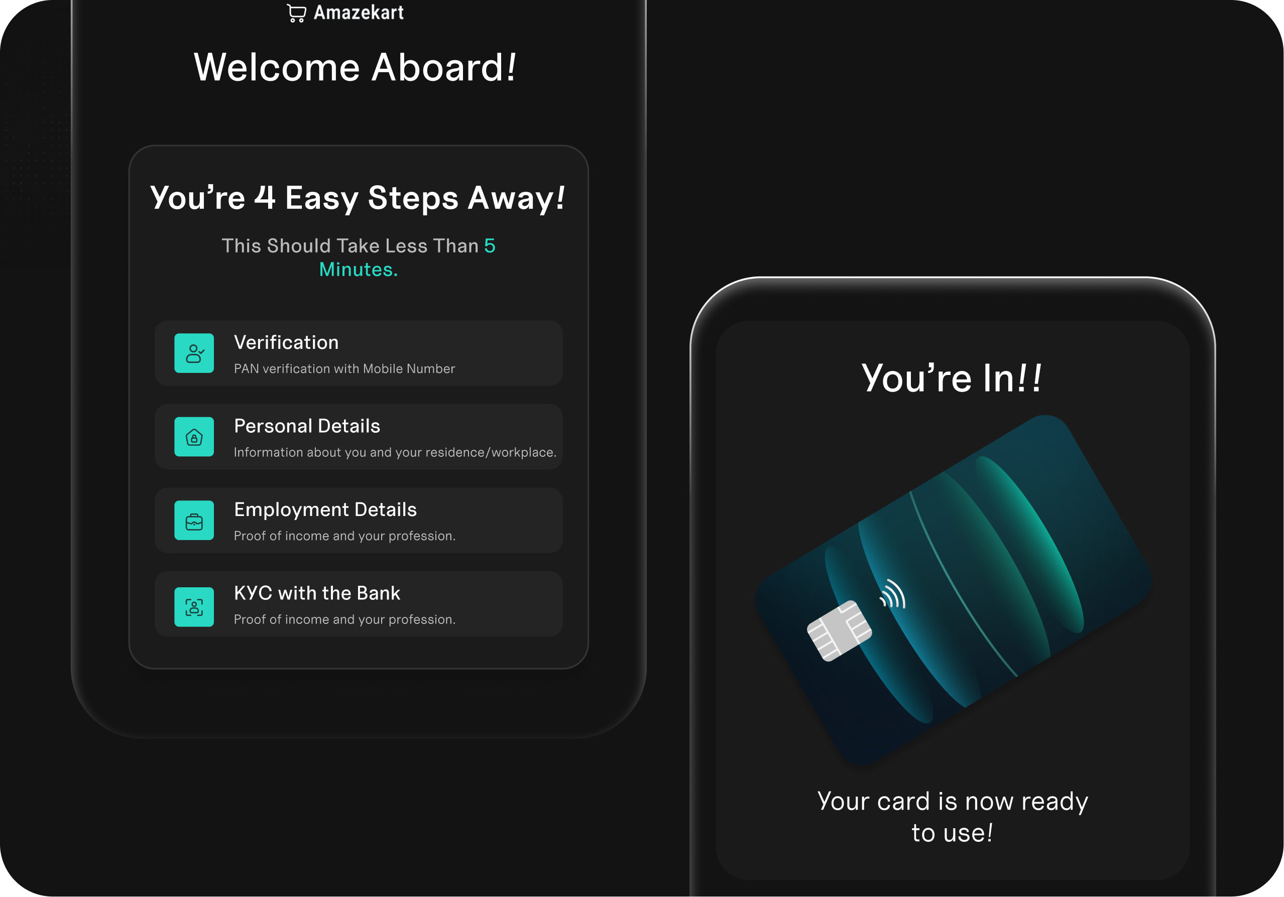
- Embed Next — a literal phone and card, the one exception in the family, because that product genuinely is an object.
Product Pages
The same grammar runs down through the product pages. Smart Engage holds one cardholder’s actual experience at its centre — a card, a nudge, a balance, a milestone — with signal nodes floating around it, each naming the exact element on the screen its connector line ends at. Embed Next opens on an hourglass, a bank’s existing systems converging into a single integration and fanning back out into multiple co-brand programmes, which is the sentence "one integration, multiple co-brand programmes" drawn as a picture and needing no copy at all.
The Outcome
Every number, node and label on the site traces back to something Hyperface has published or can prove. On a site whose job is to convince banks you are the expert, one invented detail costs more than a mediocre layout ever will. What Hyperface took into development is not a bigger version of the site they had. It's a different argument, and a language their team can keep extending into products and pages we've never seen. Looking like the scale you operate at and looking like the expert turned out to be the same job.