BPOC: Convergence of Human and Machine
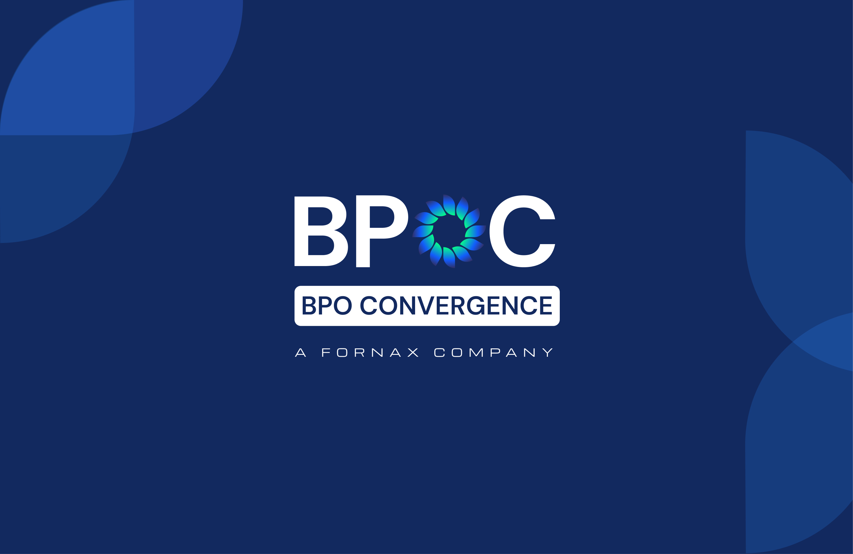
Brand identity built around convergence, where human insight meets AI precision.
Category
Success Story
Published
April 2026
Read time
3 min read
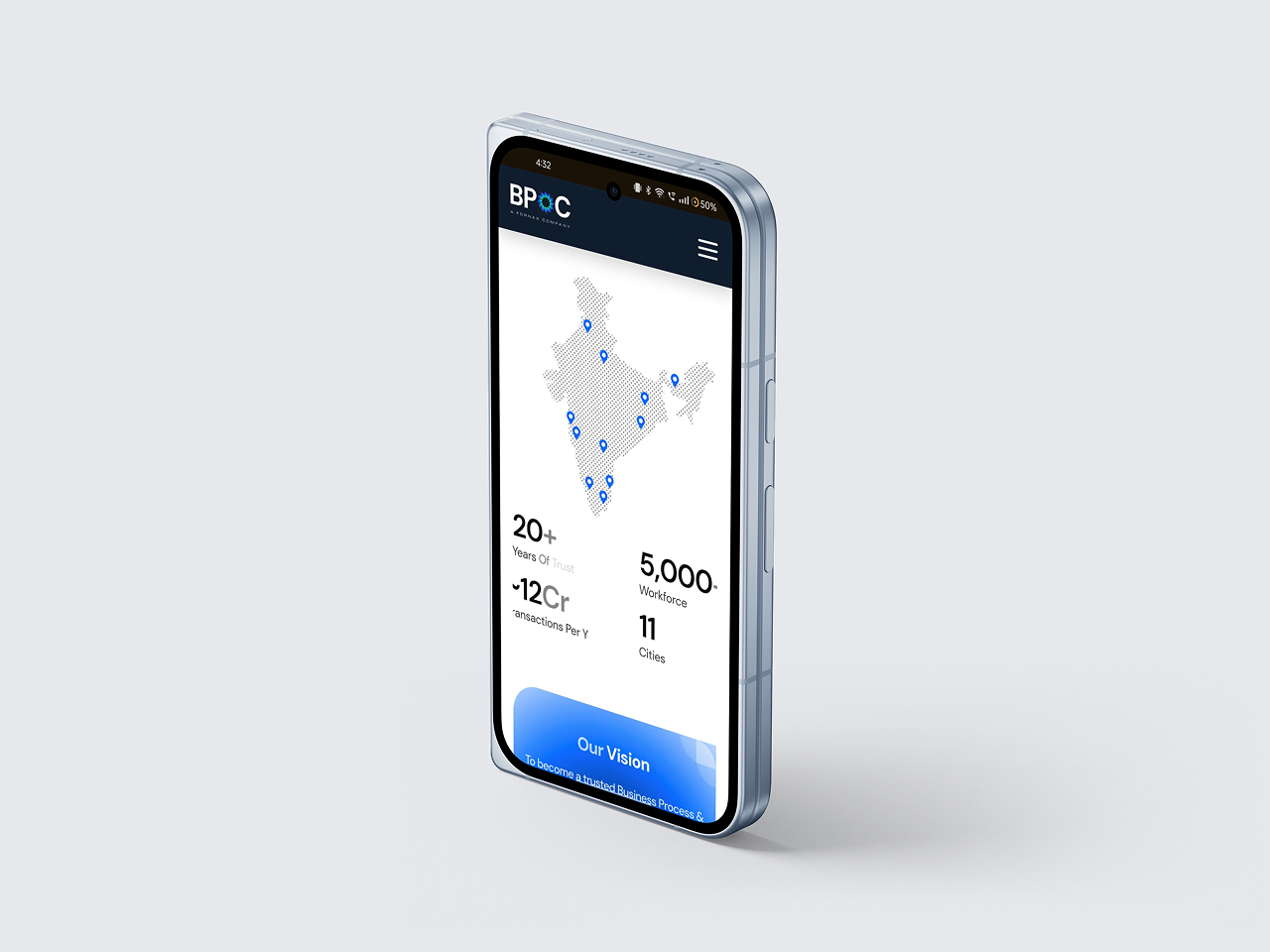
BPOC is a Business Process Management company that works at the intersection of people, processes, and technology. With over two decades of experience, it has evolved from document management into a full-scale BPM partner helping businesses scale and transform digitally.


The Challenge
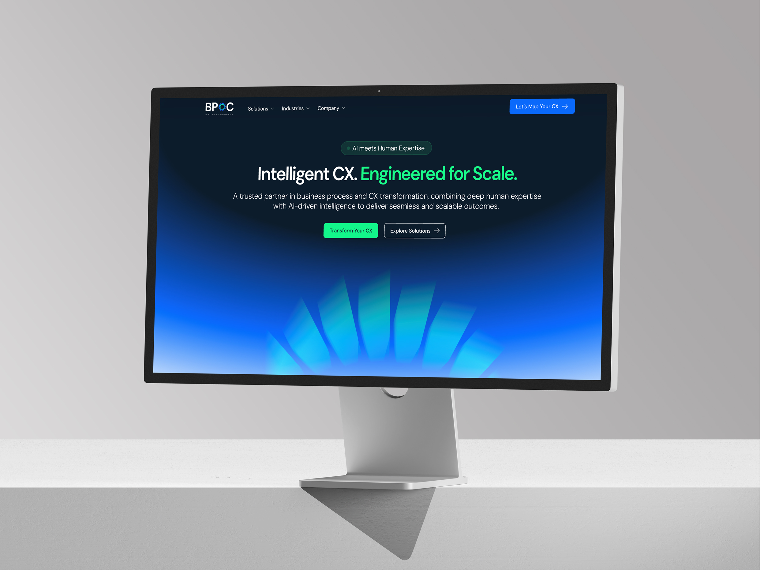
The BPO industry is crowded and visually, almost identical. Most brands rely on the same cues: corporate blues, abstract tech symbols, and messaging focused only on efficiency. The result being that everything feels functional, but nothing feels distinctive. For BPOC, the challenge was clear: create an identity that feels modern and technological, while still holding on to human warmth and cultural depth.
The Approach
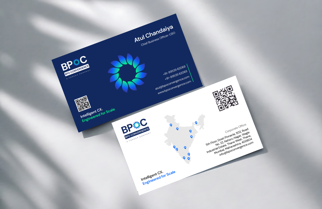
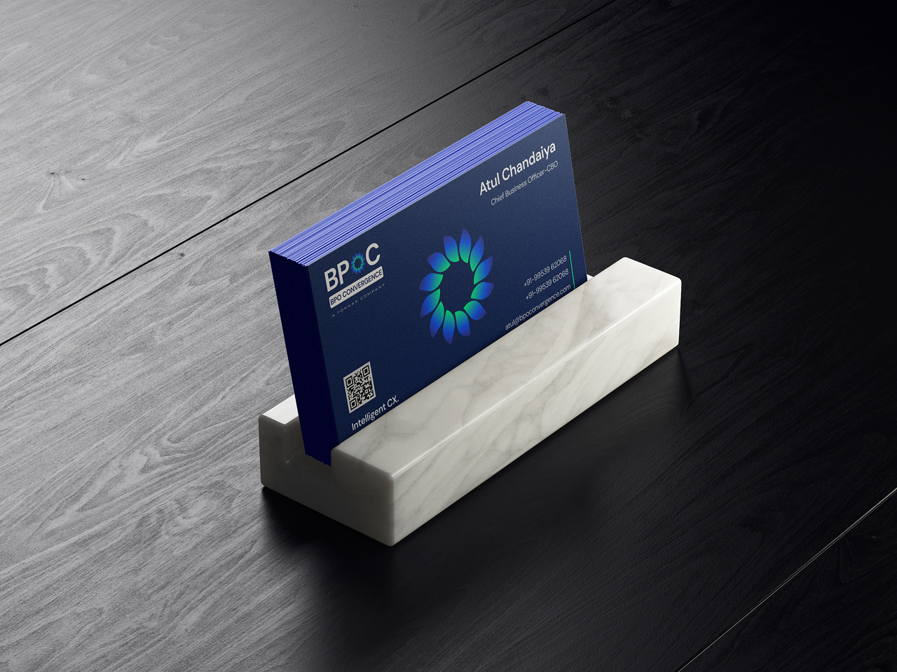
The idea was simple: Bring together two worlds that are usually kept apart. Instead of showing technology and people as separate elements, the identity was built around convergence. Everything in the system needed to reflect multiple inputs coming together into one unified output. At the center of the identity is a symbol inspired by a floral form, constructed using precise geometric shapes. It balances two opposing ideas: organic and human; structured and technological. The inward-facing petals represent different elements like people, systems, and technologies, coming together at a single point.

The Outcome
The final identity positions BPOC as more than an outsourcing company. It presents the brand as a convergence system, where human understanding and machine intelligence operate together to drive better outcomes. In a category that often feels repetitive, the identity creates a clear point of difference while still feeling credible, scalable, and future-ready.