Project Concept
A brand identity for Vault that reimagines cybersecurity as simple, intuitive, and approachable.
Published On
April 2026
Reading Time
3 min read
Overview
Vault is a cybersecurity platform built to make digital protection feel simple, clear, and accessible.
In an industry where most products feel complex and intimidating, Vault takes a more user-first approach, focusing on ease, clarity, and quiet reliability. It is designed for people who want to feel secure without needing to understand the complexity behind it.
The identity reflects this philosophy:
"Security works in the background, without creating friction or fear."
Challenge
Cybersecurity branding often relies on intensity.
Dark interfaces, aggressive visuals, and overly technical language are commonly used to signal strength and control. While this builds a sense of power, it also creates distance, making products feel difficult to approach or trust.
For Vault, the challenge was to break away from these patterns without losing credibility.
The identity needed to:
feel secure, but not overwhelming
feel modern, but not overly technical
most importantly, feel easy to trust at first glance

Approach
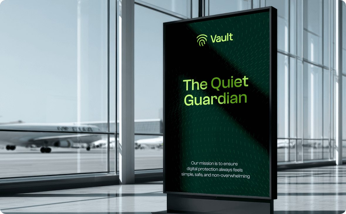
The idea was to position Vault as a quiet guardian.
Not something that constantly demands attention, instead, something that is always present and dependable. The focus was on reducing visual noise and building a system that feels calm and intuitive.
So, rather than dramatizing security, we simplified it.
It communicates protection through clarity, not complexity.
The logo brings together two familiar ideas into one unified mark.
A fingerprint represents personal identity and individuality,nwhile radiating signal arcs represent continuous monitoring and digital protection.
This combination creates a symbol that feels both human and technological, yet system-driven.
The wordmark adds a subtle but important detail.
A custom “a” is shaped like a padlock, grounding the identity in a universally understood symbol of safety without relying on obvious or overused visuals.
Together, the symbol and wordmark create a mark that is distinctive, balanced, and easy to recognise across applications.

Visual Identity
The visual system is designed to support clarity and accessibility.
A deep green anchors the brand, building a sense of trust and stability.
Lime accents introduce contrast and energy, helping key elements stand out without overwhelming the user.
Typography is clean and modern, chosen for readability across both digital interfaces and communication materials.
Supporting graphics and patterns are kept minimal and consistent, allowing the identity to scale seamlessly across product screens, marketing, and brand touchpoints.
Brand Feel
Vault feels calm, controlled, and dependable.
It avoids the urgency and fear often associated with cybersecurity, and instead focuses on reassurance. The experience is designed to feel straightforward and intuitive, reducing friction for users who may not be technically inclined.
The brand speaks with confidence, but without complexity.
Outcome
The final identity positions Vault as a cybersecurity platform that people can approach with ease.
It shifts the perception of security from something intimidating to something intuitive and reliable. By combining familiar visual cues with a clean and modern system, the brand creates immediate trust without overwhelming the user.
Vault becomes a quiet, constant layer of protection that users don’t have to think about, but can always rely on.