Project Concept
Simplifying Career Readiness Through User-Centered Design
Published On
Dec 2021
Reading Time
5 min read

Overview
Mytransform was built to address a critical gap in youth career readiness in India by creating an ecosystem where learning connects directly to career outcomes. Their platform aimed to guide students from skill-building to employability through structured programs and resources.
The vision was strong.
The experience needed refinement.
As adoption grew, the platform’s complexity began affecting usability, scalability, and training costs.
The objective was to redesign the experience so the product could scale efficiently while delivering real value to learners.
The Challenge
The primary issue was the journey.
The existing platform had a steep learning curve, which led to:
Heavy reliance on training and onboarding
High recurring operational costs
User confusion in navigating features
Drop-offs due to cognitive overload
Additionally, multiple teams had worked on the product over time, resulting in:
Inconsistent UI patterns
Fragmented flows
A scattered design system
Lack of visual and functional harmony
Mytransform needed a more intuitive, scalable, and cohesive experience.
Process
We approached the redesign from a systems-thinking perspective.
1. UX Audit & Flow Mapping
We analyzed existing user journeys to identify friction points, redundancies, and confusing pathways. This revealed where users struggled most and where simplification would have the highest impact.
2. Design System Realignment
A structured design system was rebuilt to:
Standardize components
Ensure visual consistency
Improve development efficiency
Create a unified product language
This provided a strong foundation for scalability.
3. Feature Simplification
Complex workflows were broken down and restructured into clear, sequential steps. The focus was on reducing cognitive load without reducing capability.
4. UX-Led Strategy
Every decision was guided by user value:
What does the user need right now?
What can be hidden, automated, or simplified?
How can we reduce effort while increasing clarity?
Design
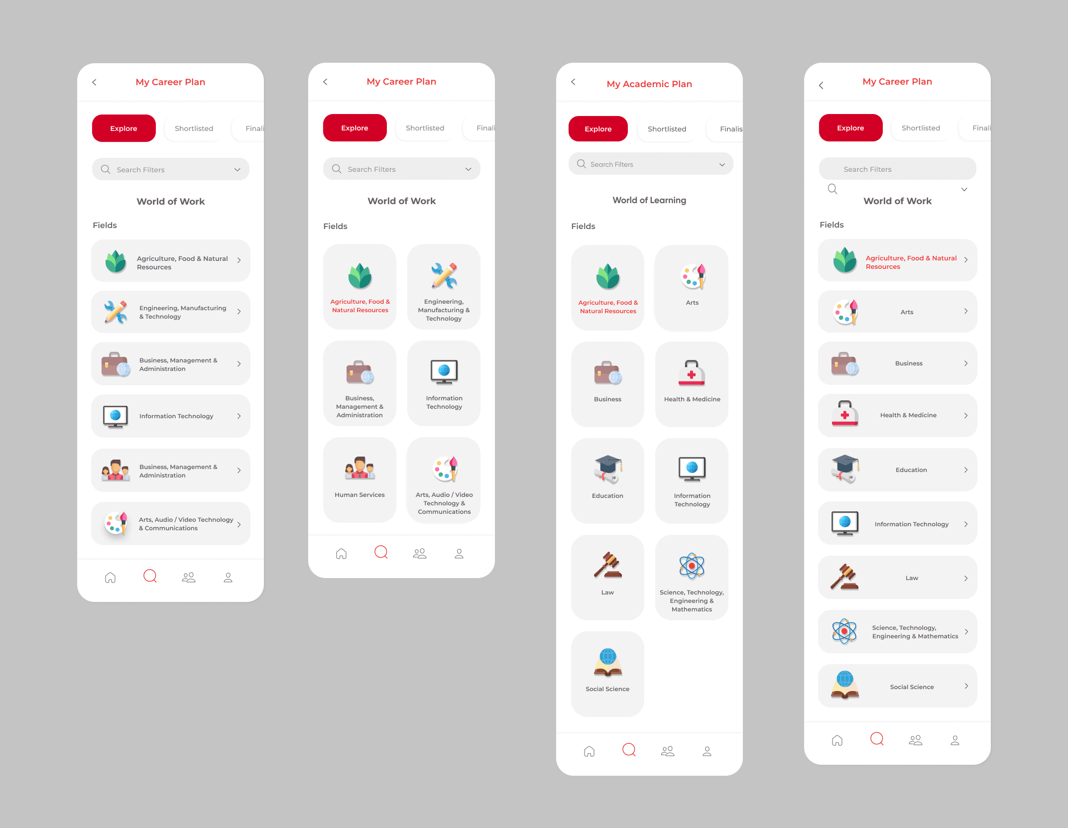
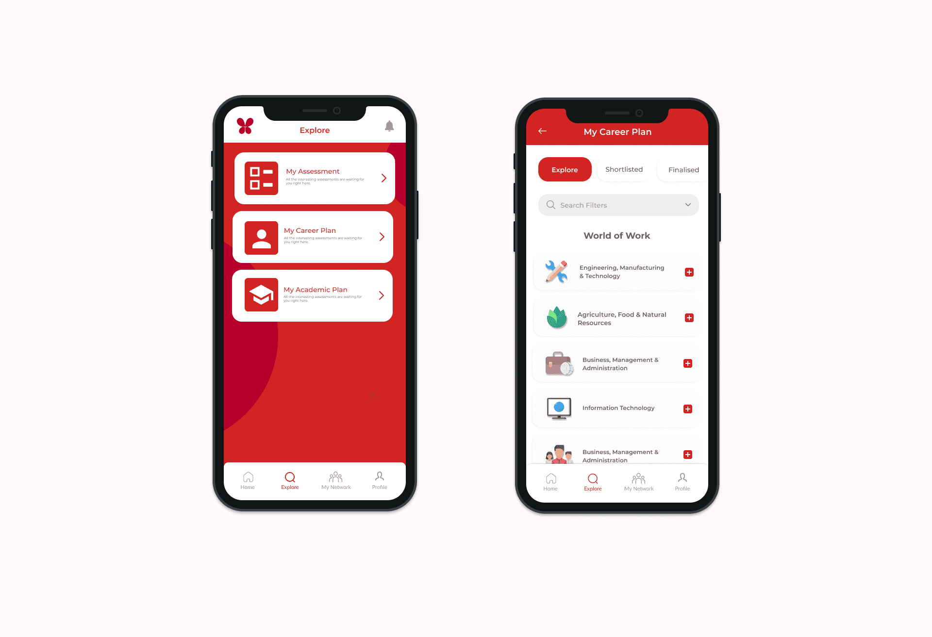
The redesign prioritized clarity, flow, and usability.
Clean, Focused Interface
The UI was redesigned to be comprehensive yet uncluttered, ensuring key actions remained prominent without overwhelming the screen.
Intuitive Navigation
Users can now move between functionalities effortlessly, with logical pathways and predictable interactions.
Visual Balance
The interface allows visuals to enhance the experience rather than compete with functionality.
Consistency Across Touchpoints
Unified components and patterns ensure users don’t have to relearn interactions as they move through the platform.
Outcome
Key impact:
Reduced dependency on user training
Lower long-term operational costs
Improved user retention
Faster onboarding and adoption
A scalable design system for future growth
Most importantly, the platform now supports its mission:
helping young users move from learning to livelihood with confidence and clarity.